Breaking Ground
Breaking Ground is Sprout Social's quarterly product-focused webinar series, showcasing new releases and driving product adoption. The goal is to create an exhilarating experience for social media practitioners and instill confidence in Sprout as the key to business impact.
I led the art direction and development of a theme-based visual system built with flexibility and focus. Each quarter's event theme shaped a distinct visual narrative and color strategy, while remaining grounded in a consistent sub-brand identity.
Contributions
Creative Strategy, Art Direction, Image Generation, Visual Design
Q2’26 Key Results
5,001 registrations — 104% of goal, 264 hand raisers — 110% of goal
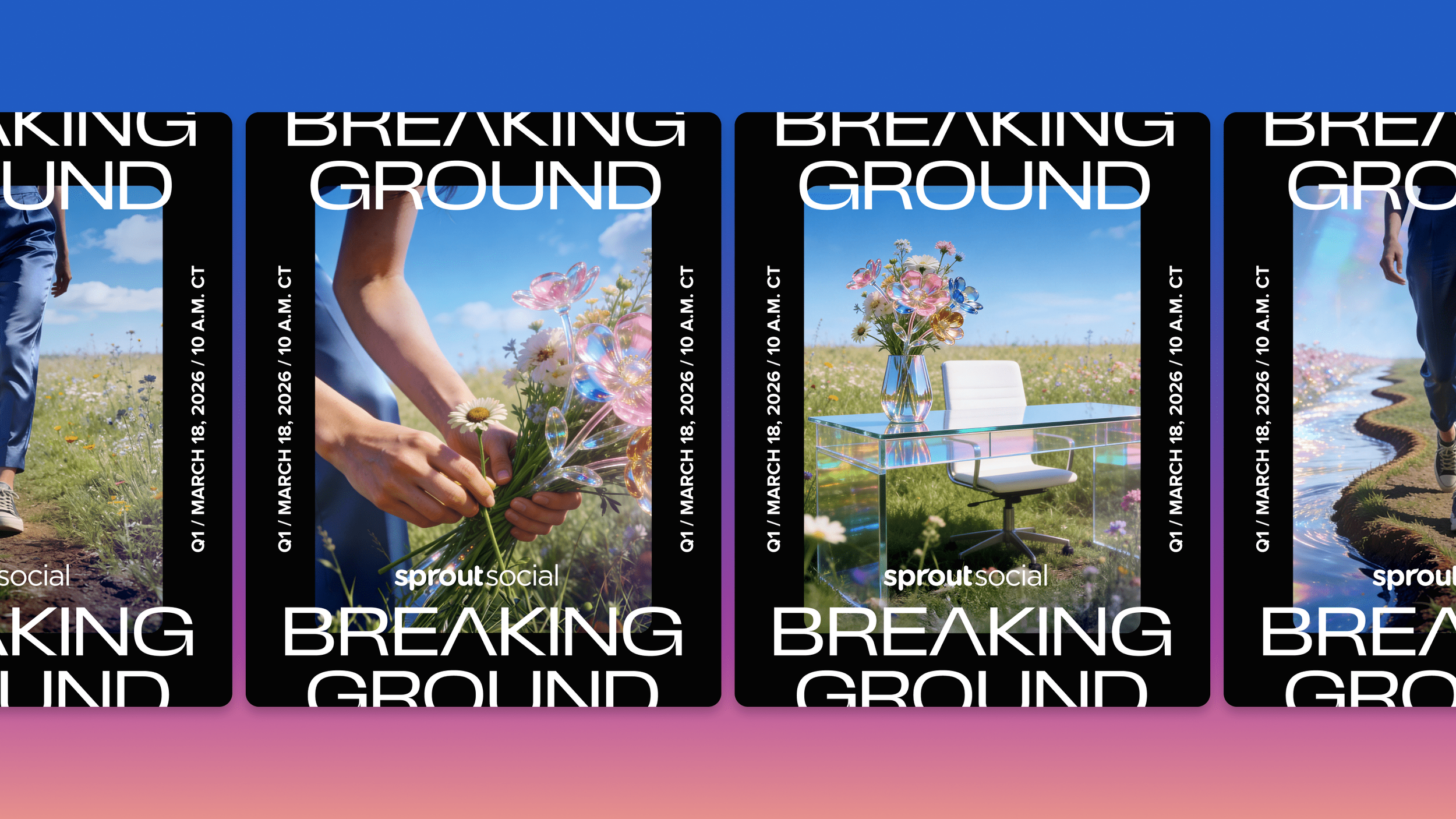
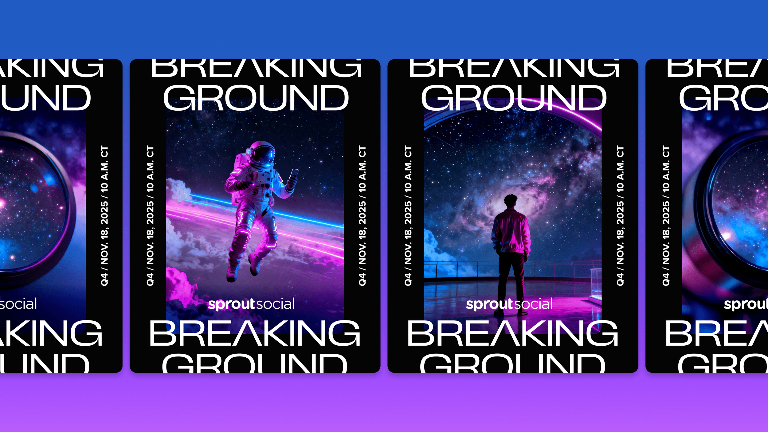
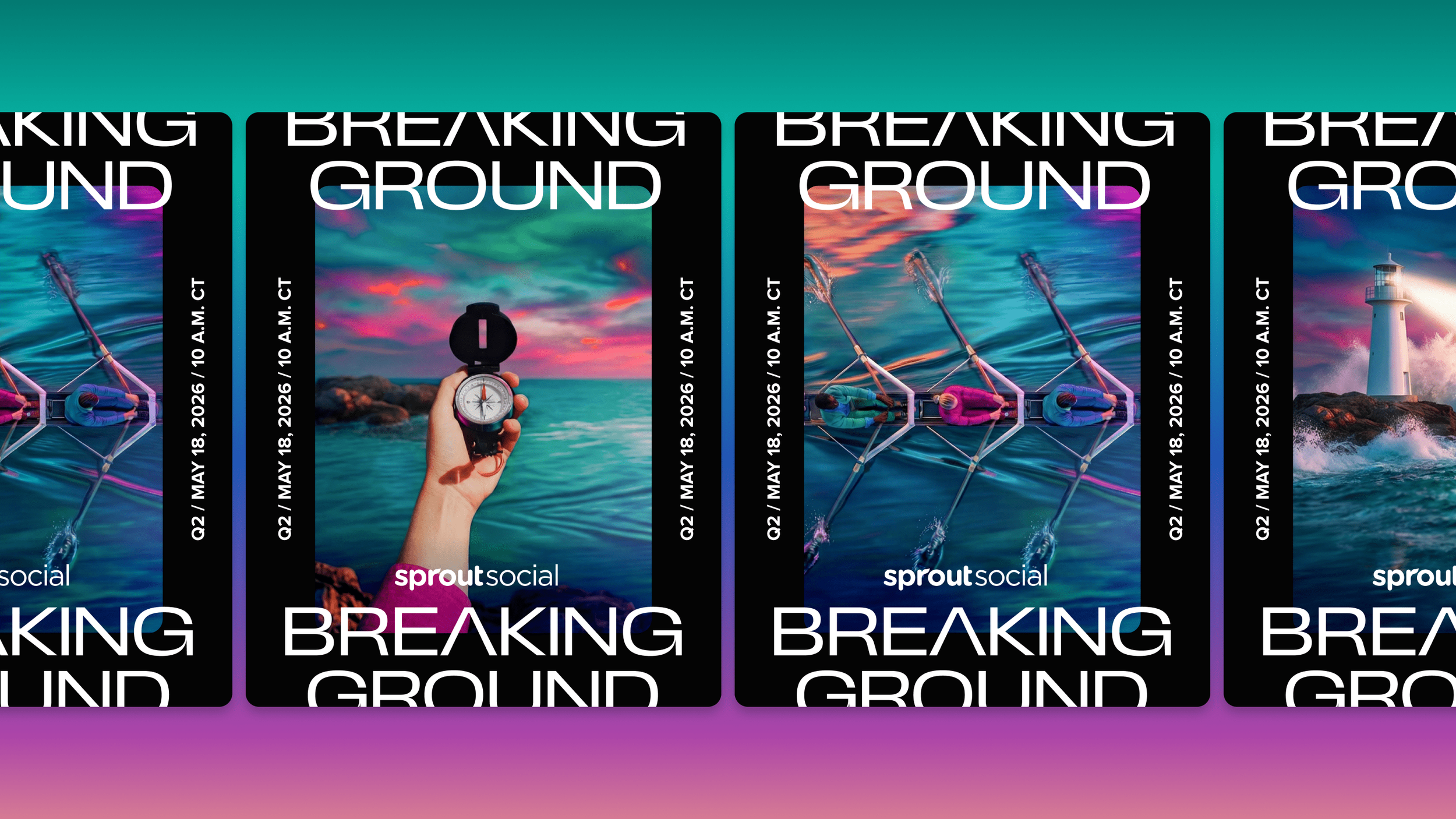
Adaptive visuals across the event arc
I directed the full visual arc for the event experience, evolving the creative strategy across pre-event promotion, the live event, and post-event communications to support each stage's goals. The design moved from bold, inspirational imagery meant to spark curiosity, to a cohesive live-event presentation, to clear, trust-building product narratives post-event, evolving with the message at each stage while staying connected as one unified experience.
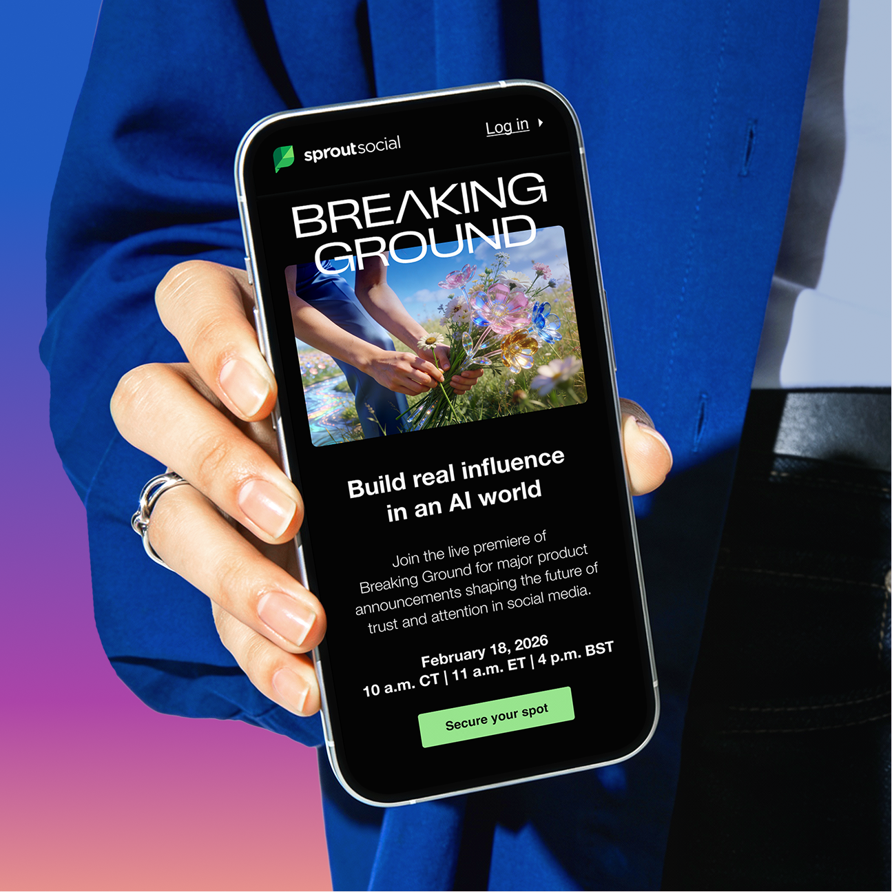
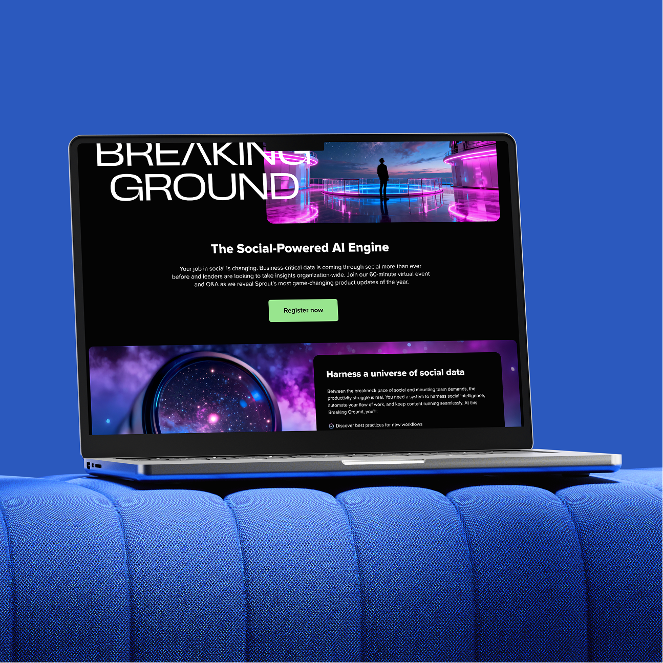
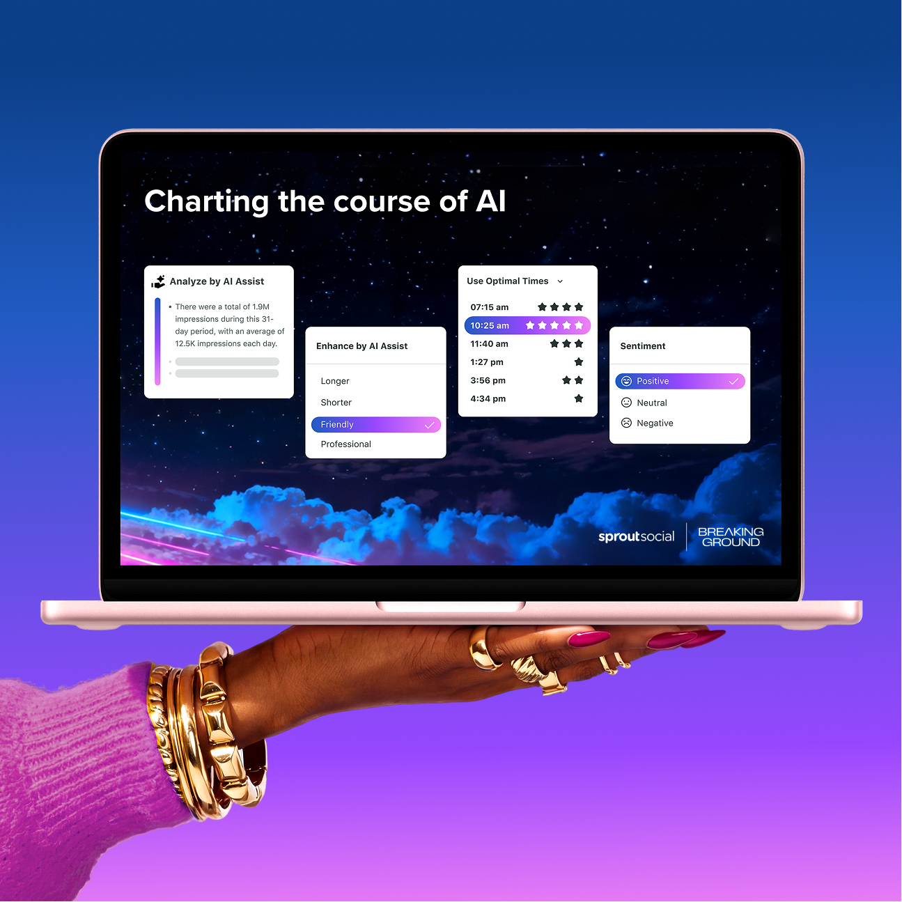
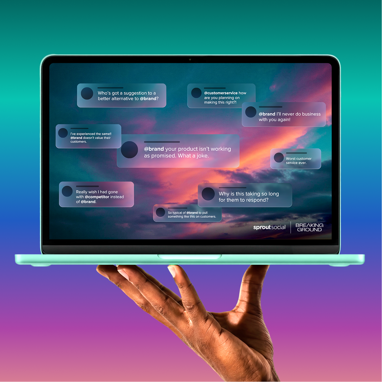
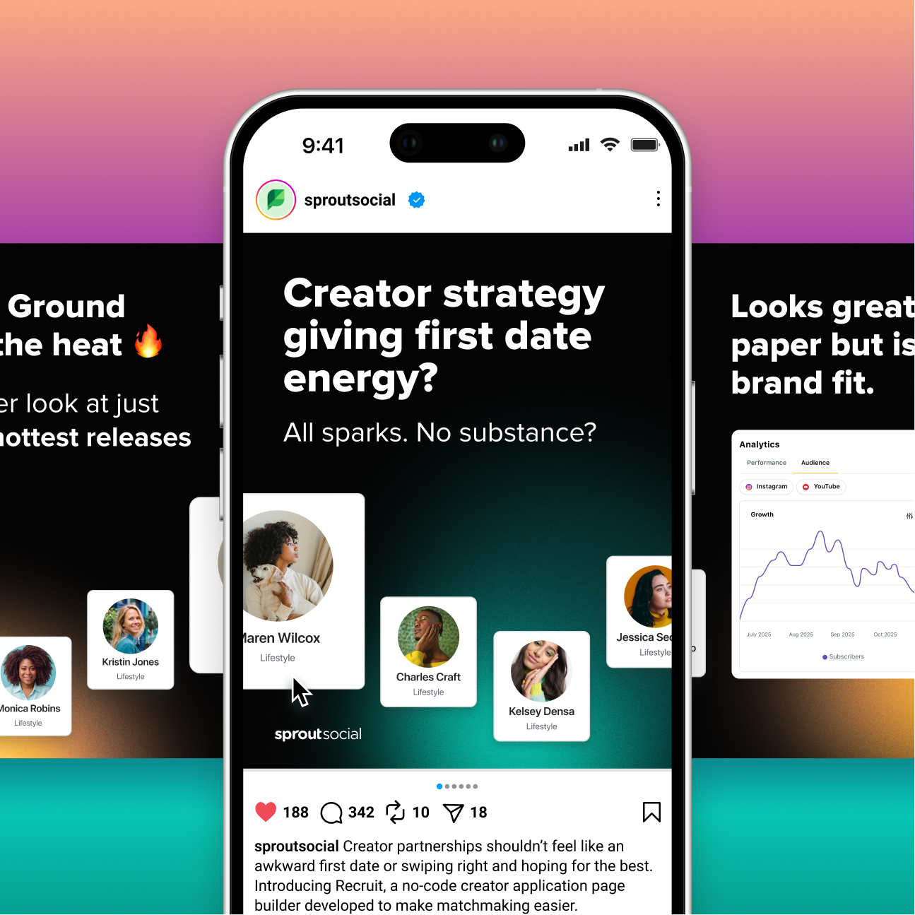
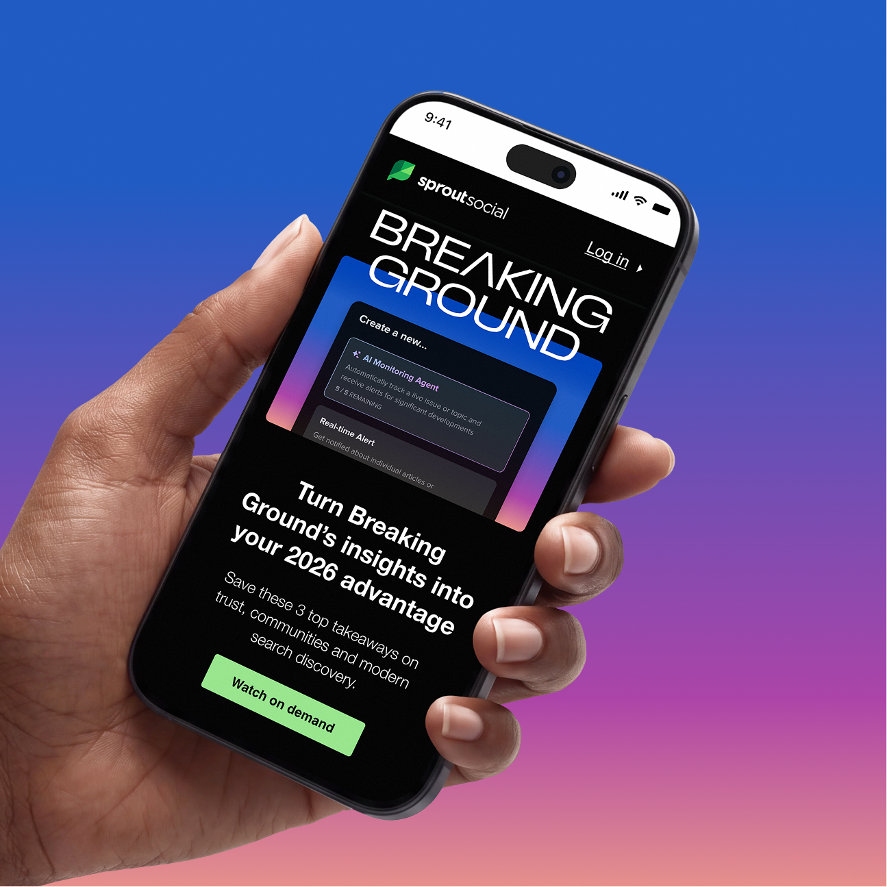
Conceptual imagery for strategic storytelling
For Breaking Ground, I pitched a new creative execution for the Sprout brand: conceptual, AI-generated imagery. Each quarter, the process began by defining a style and visual narrative for an image library. The resulting images reflected the event's topical theme, helping to tell an evolving story about what's next in social and highlighting the opportunities for social teams.
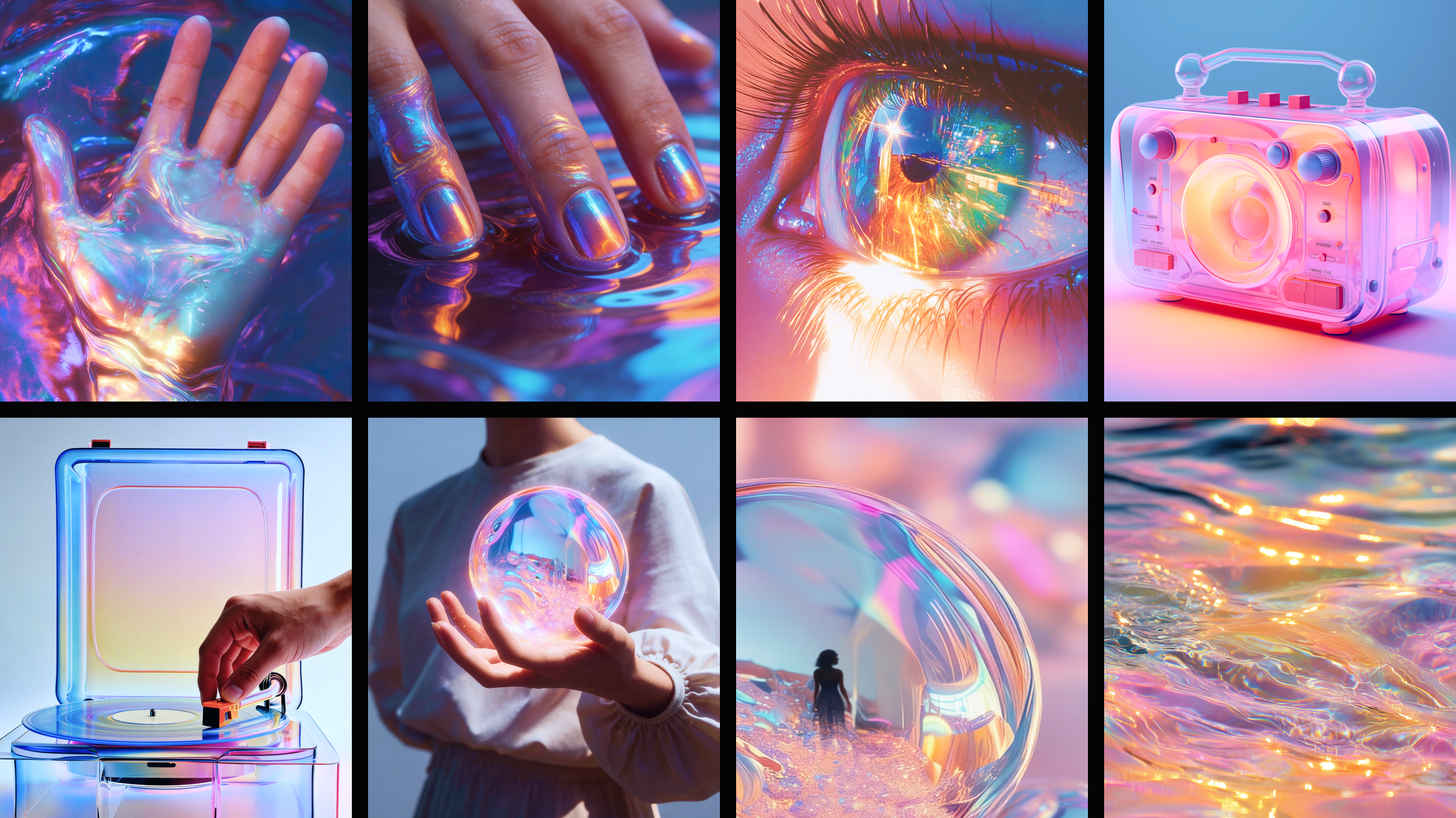
Setting the Q1’26 "Proof of Reality" photo direction
Photography style:
Iridescent Futurism is a vibrant, high-gloss aesthetic built on shifting color spectrums, liquid light and sleek, reflective surfaces.
Why it works:
The human form set against fluid, iridescent glass, a metaphor for transparency, visualizes the tension between lived reality and AI-driven content, reinforcing the need for human authenticity.
Color strategy:
Warm skin tones meet bold magentas, cool blues, and sunlit golds in fluid, holographic gradients that mirror the constant motion of AI-powered social feeds.
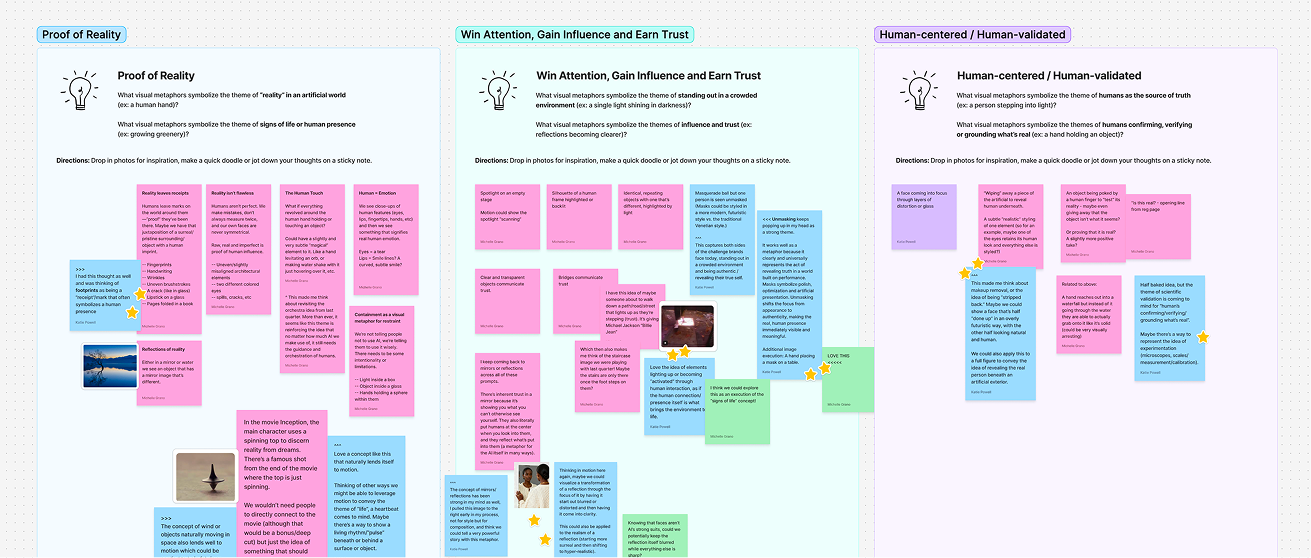
Developing a visual narrative for generated imagery
Start with the story:
The process began by ideating a core visual narrative, then applying it to 2-3 hero image directions, each testing a different visual expression of the quarter’s story and style.
Align before expanding:
Hero directions were reviewed with stakeholders to align on the strongest narrative and expression before scaling further, avoiding early over-investment in one direction.
Build the full library:
Once approved, the narrative expanded into a full library, adopting the same narrative and style so every image remained part of the unified story.
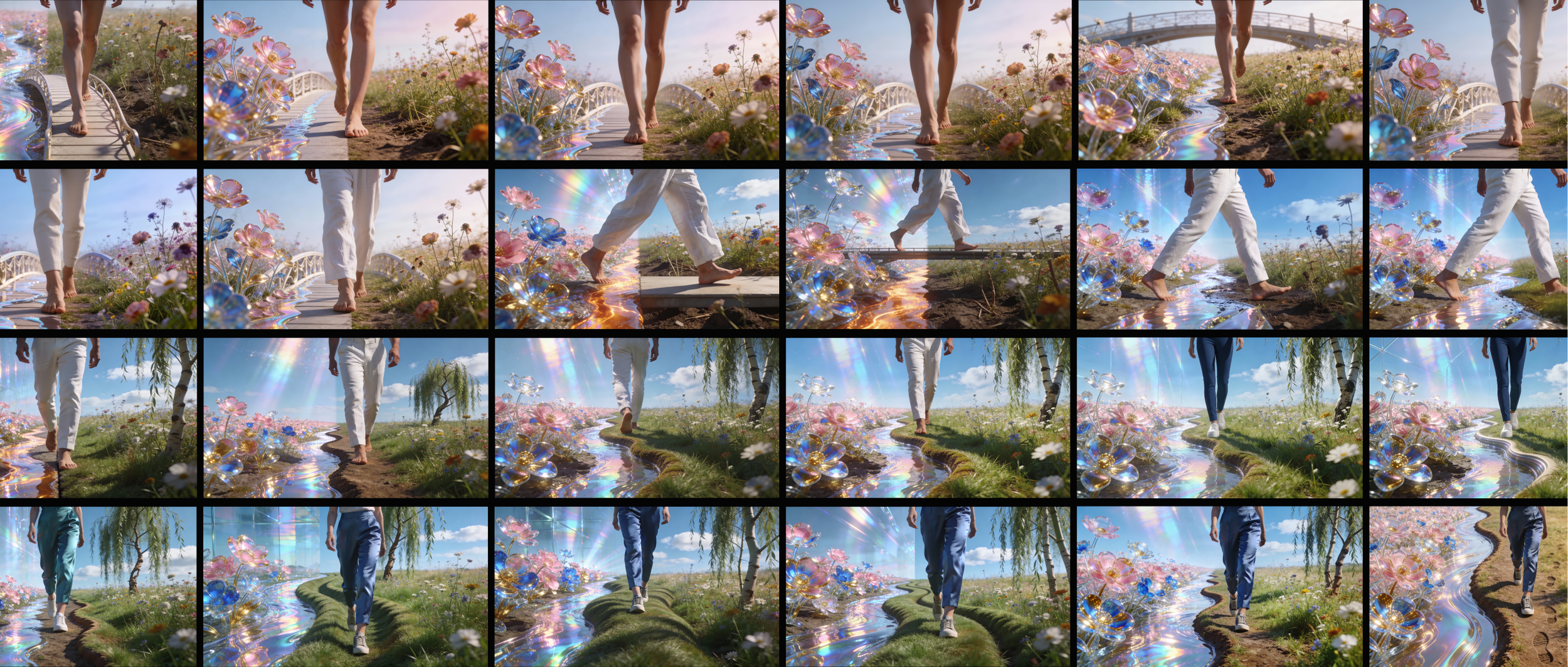
Curating the image library
Walking the line:
The hero image visualizes the idea of walking the line, an ongoing balance between AI and reality rather than a rigid choice between them. The figure moves along a winding divide, representing how the two worlds coexist.
Proof in the picking:
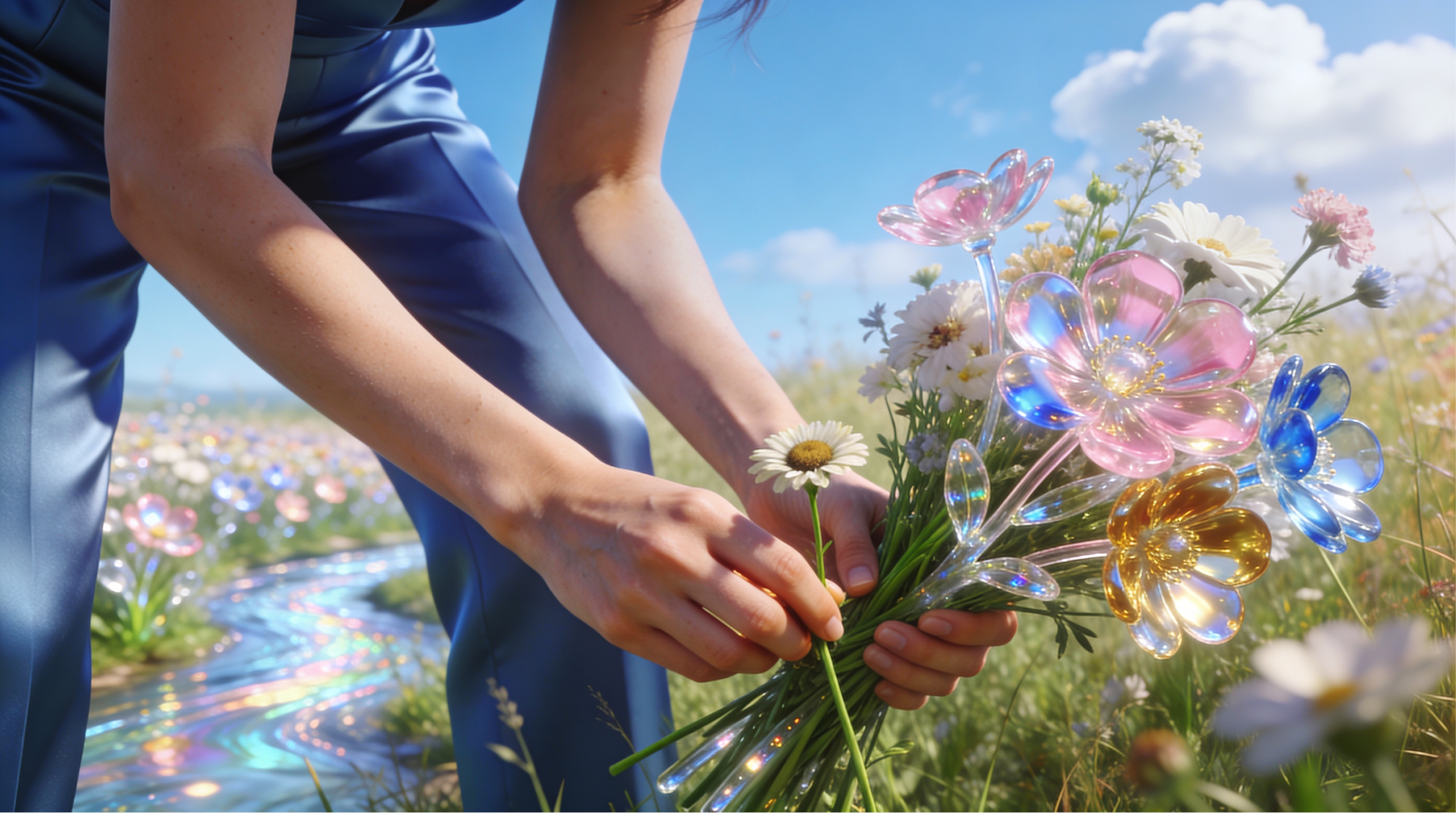
The secondary image uses gathering a bouquet as a metaphor. A bouquet isn't random; it's selected and arranged with intention, just as meaningful social content comes from human judgment, not automation.
Grounded in reality:
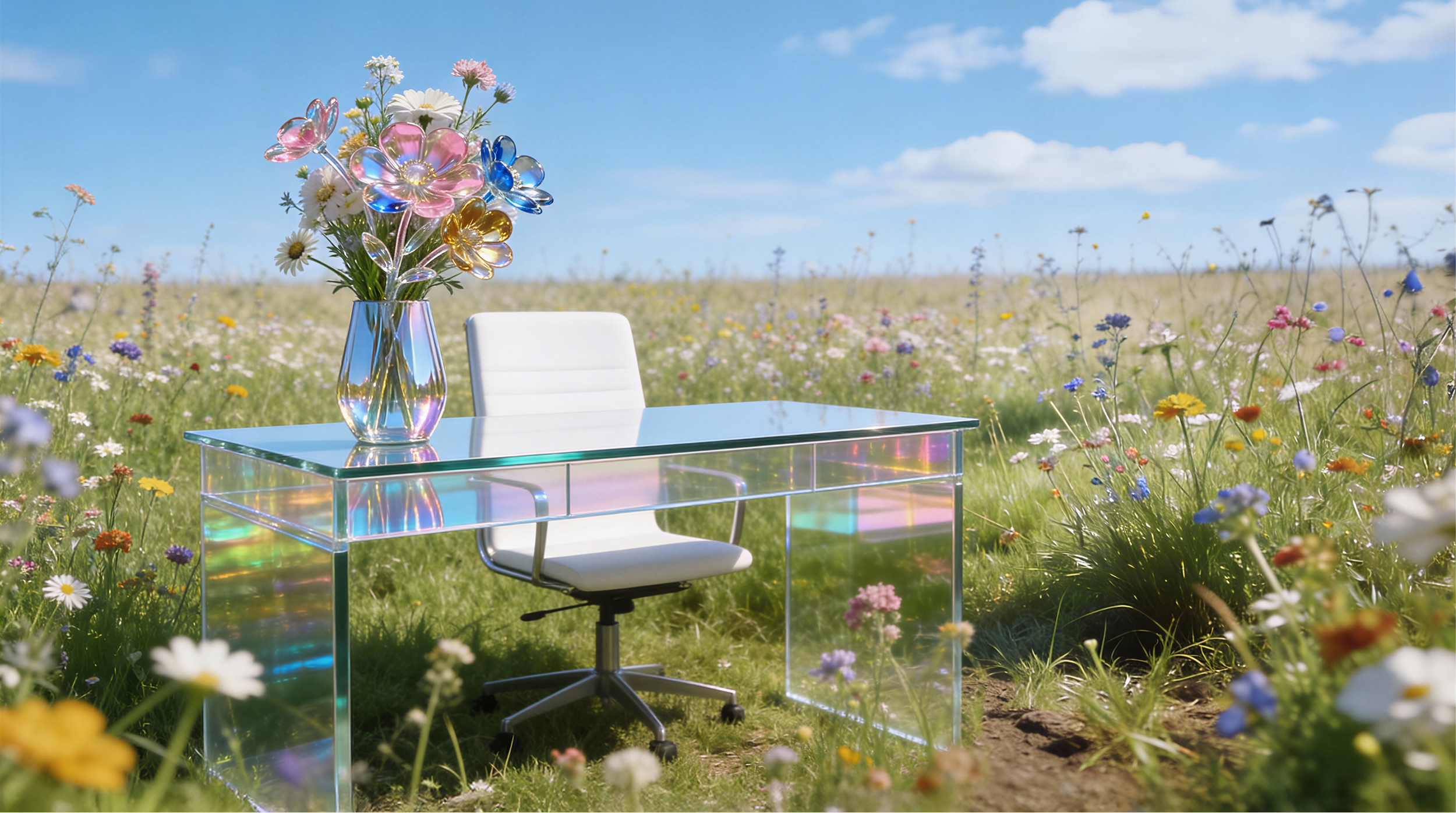
The supporting image places a desk, an object tied to work, within a natural meadow, grounding social media in real context. The glass treatment of the desk reflects AI's role as a tool that supports, not replaces, human intent.


Contributors
Michelle Grano (Creative Direction & Visual Narrative)
Arden Wilson (Presentation Design)