The Arboretum
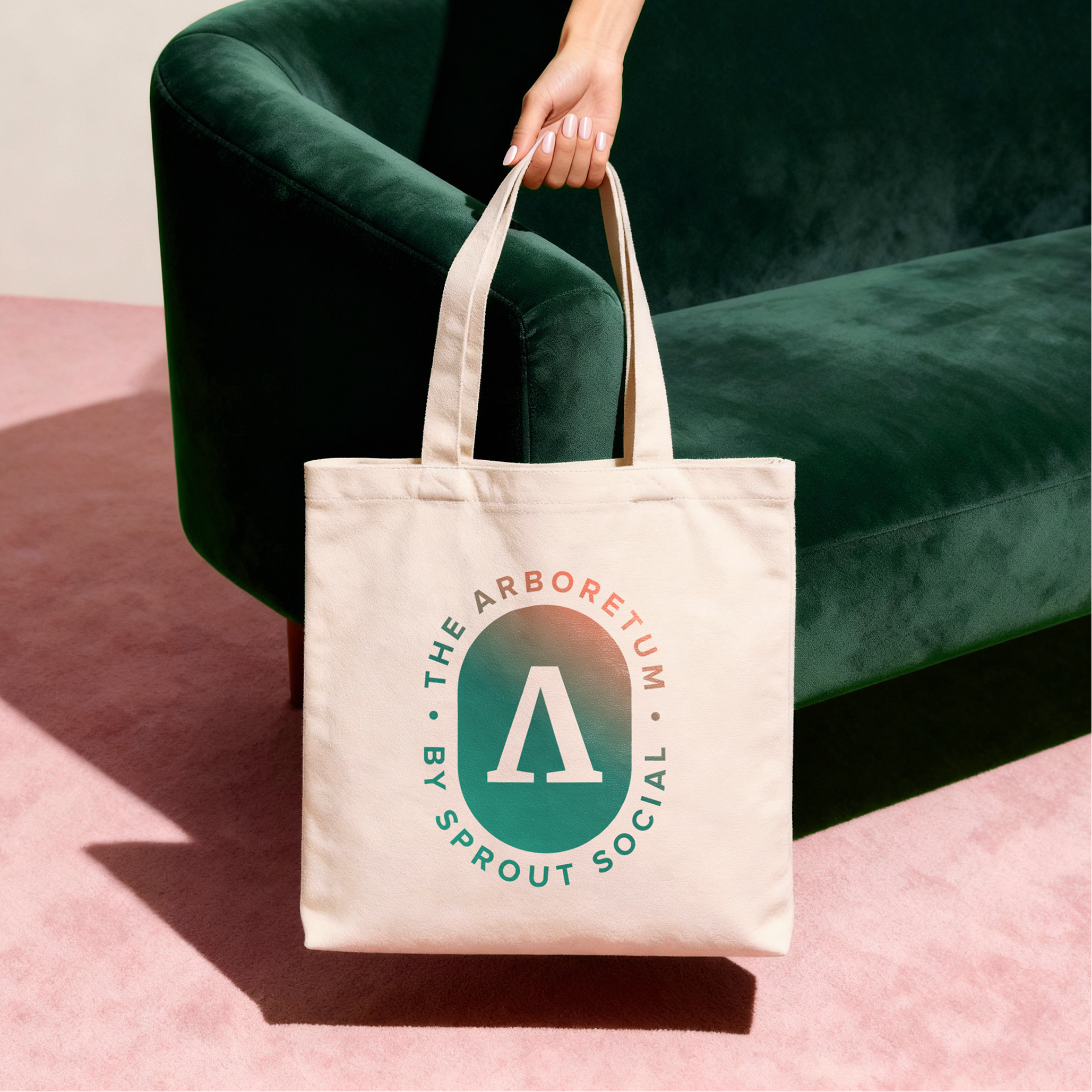
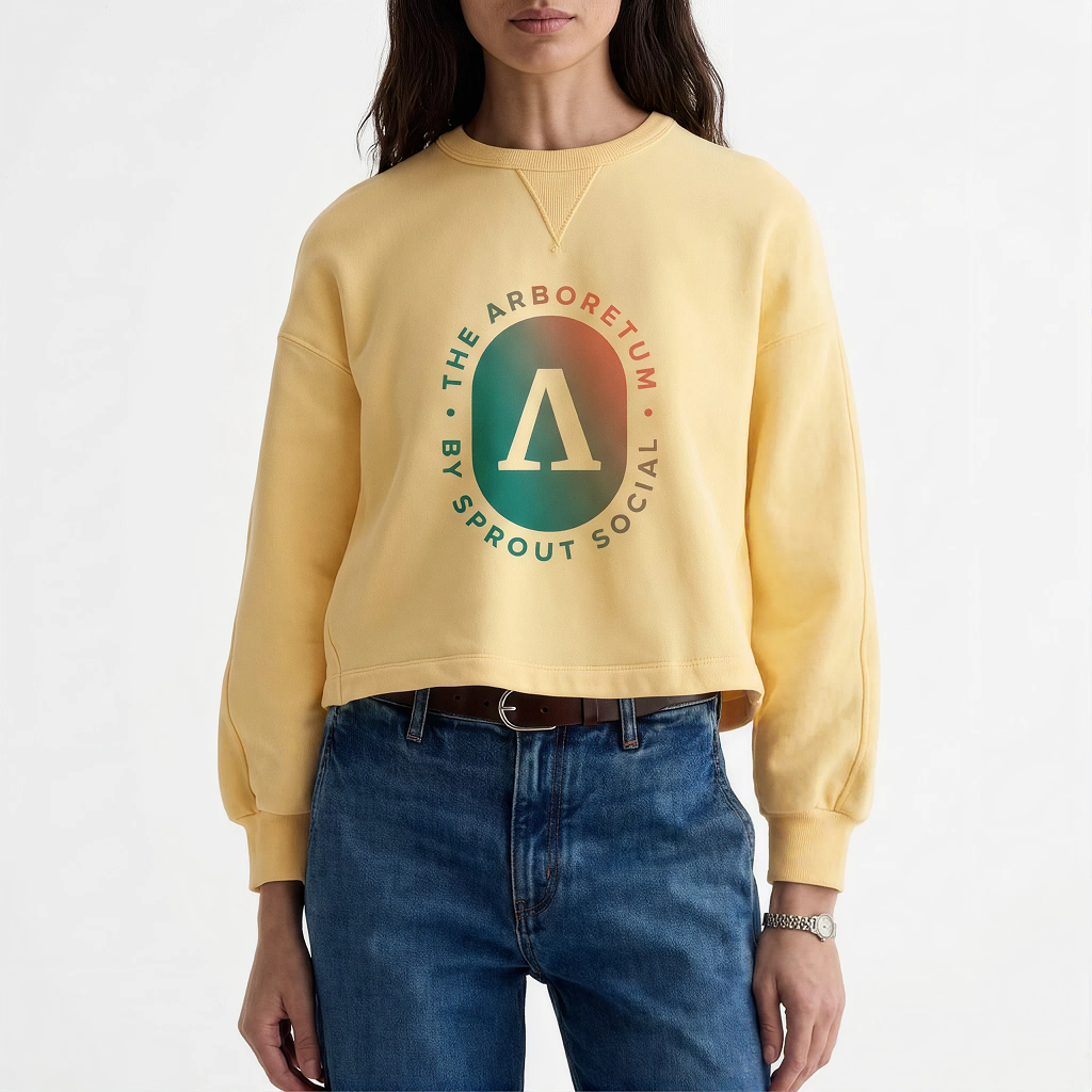
Led the visual identity development for The Arboretum (also known as The Arb), Sprout Social's digital community space for customers and social marketers to connect, support, and grow alongside one another.
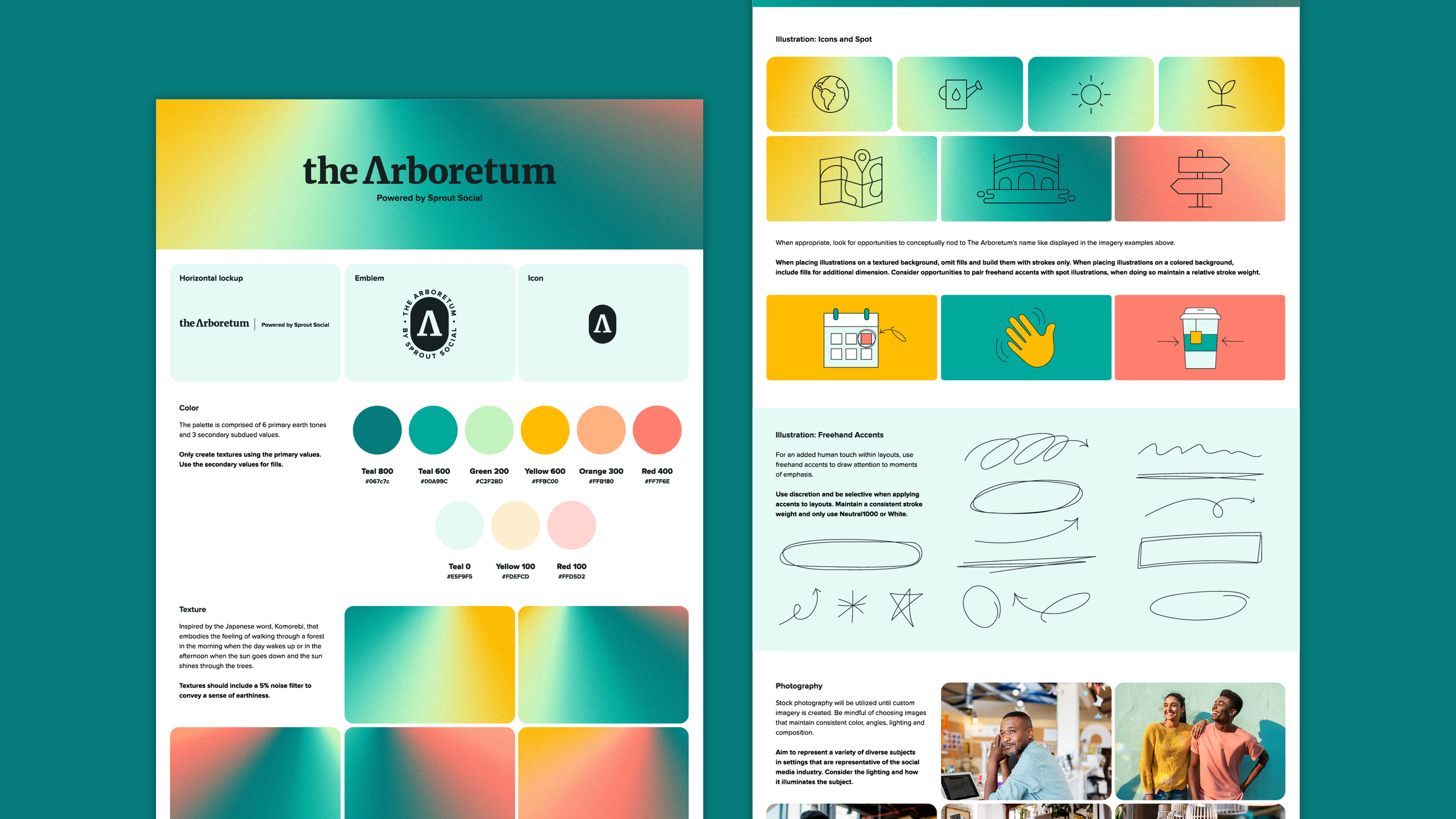
The concept was inspired by komorebi, the Japanese word for sunlight filtering through the trees. The feeling of light moving through a forest canopy became the foundation for an identity system that reflects the Arb's role as a welcoming space for connection, discovery, and shared growth.
Contributions
Visual Strategy, Art Direction, Visual Design



Drafted creative guidelines that scaled brand consistency
Developed art direction and implementation guidelines to support consistent execution across cross-functional teams and marketing partners. The guidelines made it easy to apply the identity system confidently across web, email, social, and other digital touchpoints — scaling brand consistency beyond the internal team without sacrificing quality or cohesion.
Developed storyboards to define the visual direction for a program launch video
VideoBuilt scalable templates for content at volume
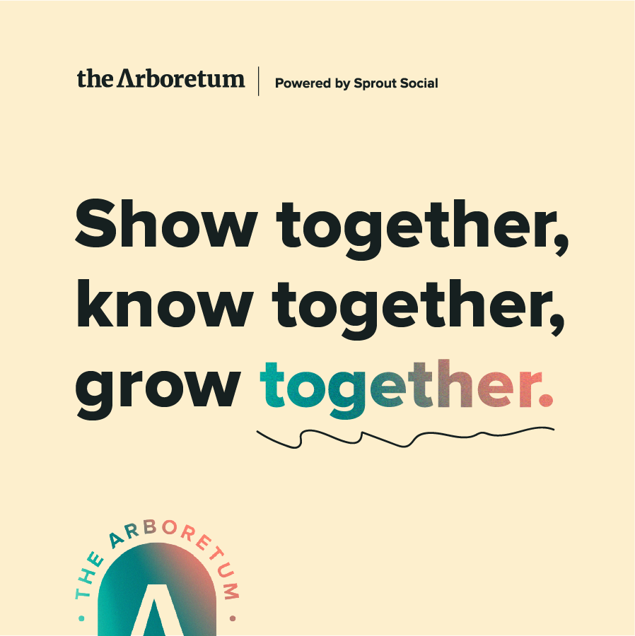
Designed a suite of templates that enabled the Community team to independently produce on-brand graphics at a high volume, reducing the need for design support on every request. The templates were built for efficiency and flexibility, allowing the team to move quickly while maintaining visual consistency across the community hub and organic social channels.